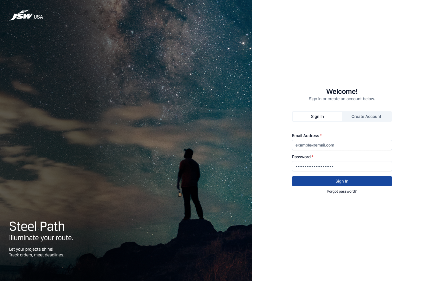
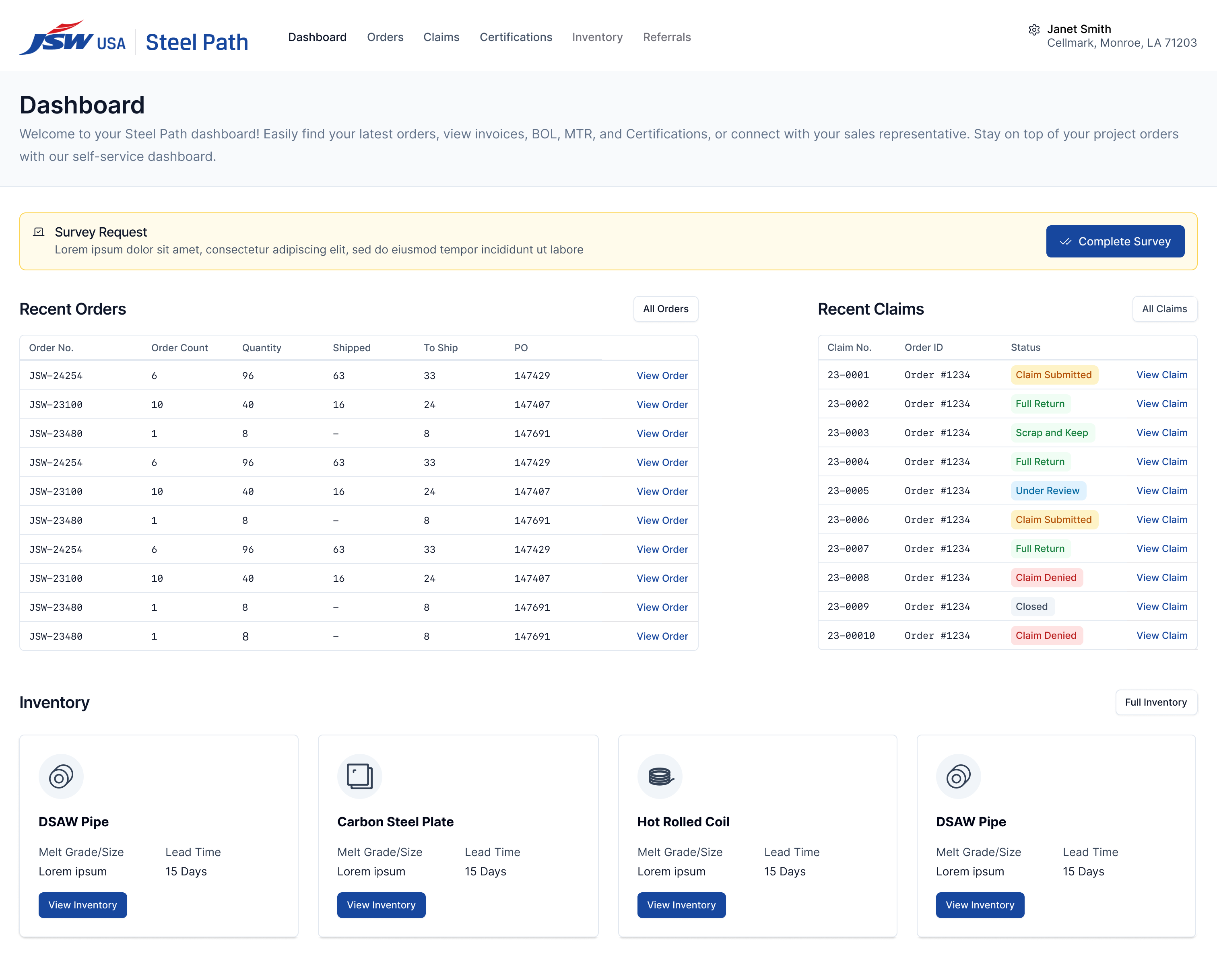
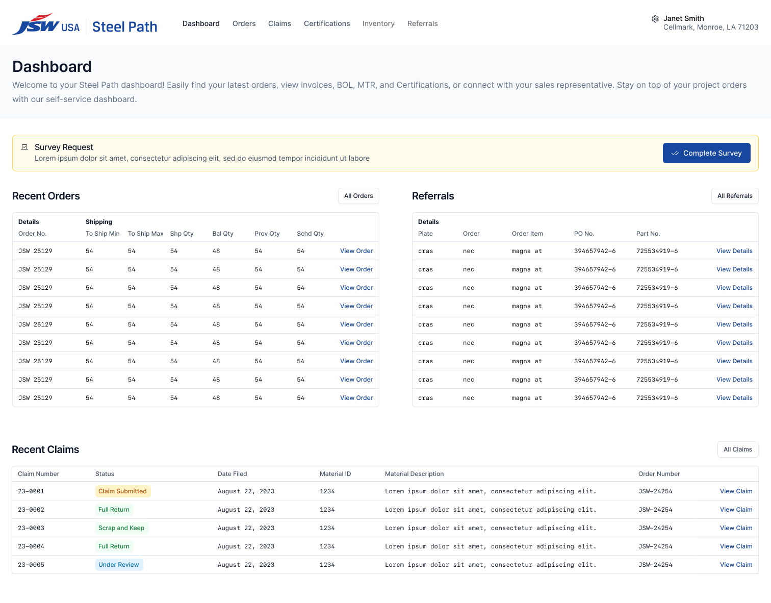
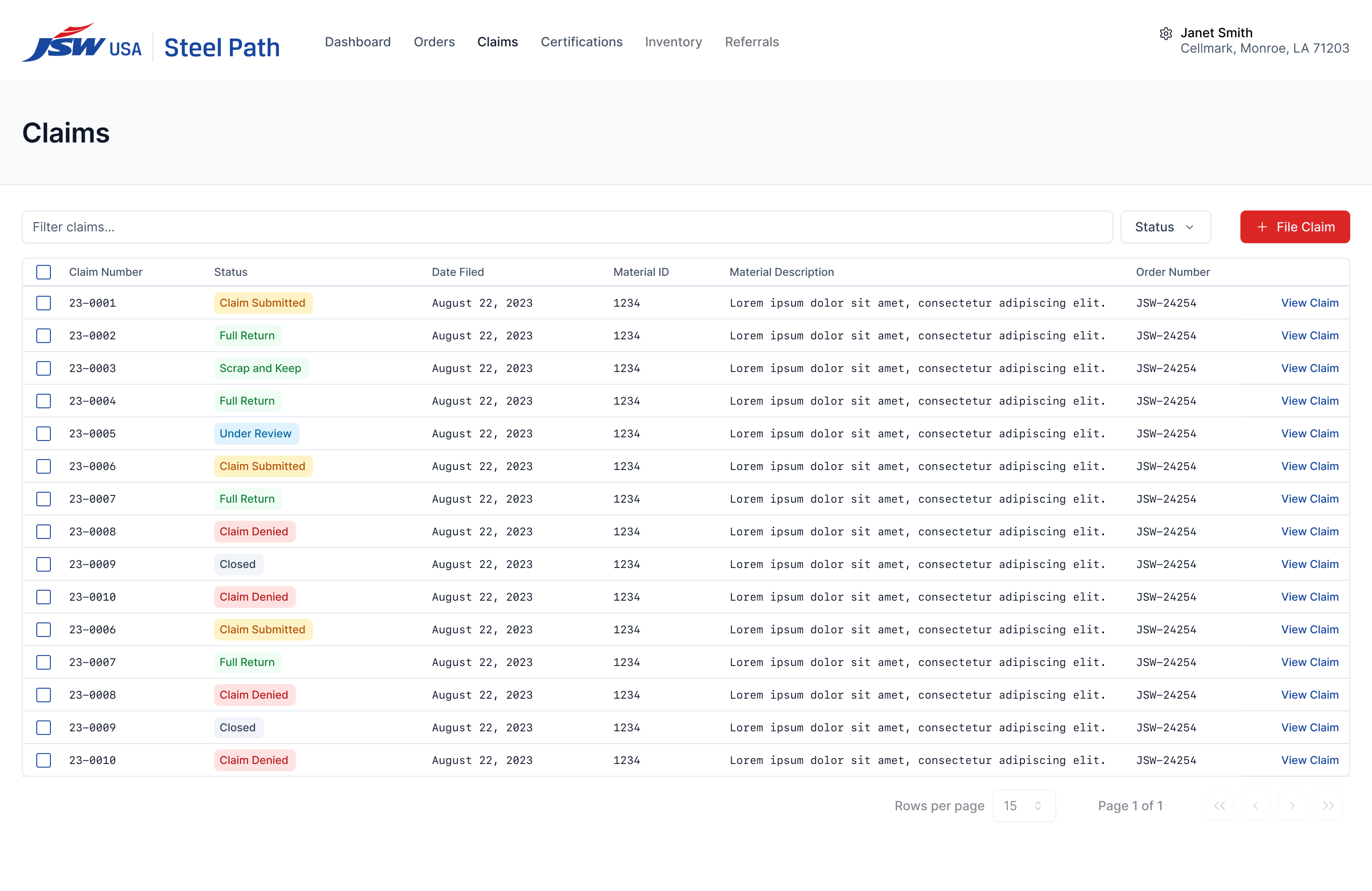
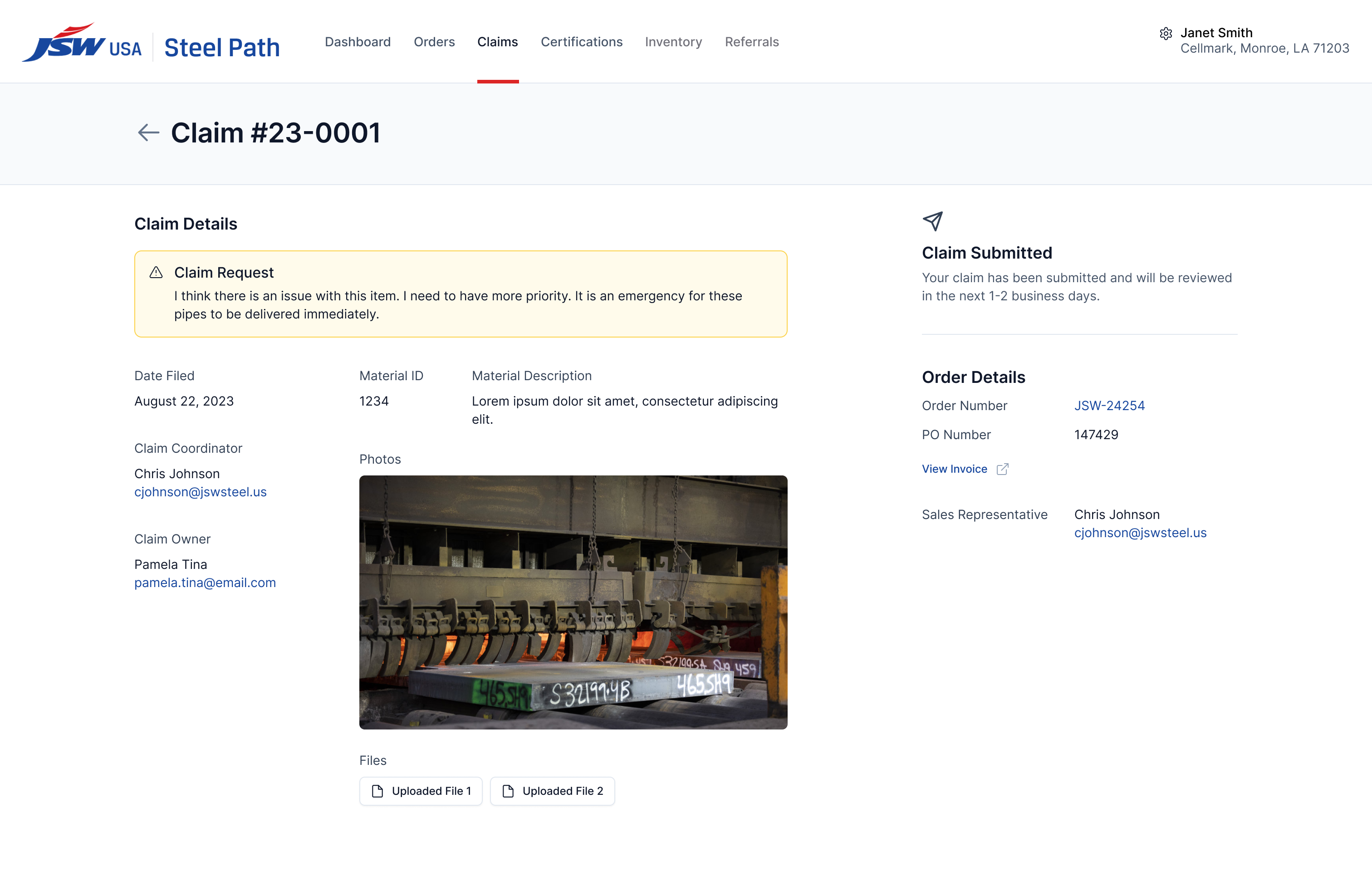
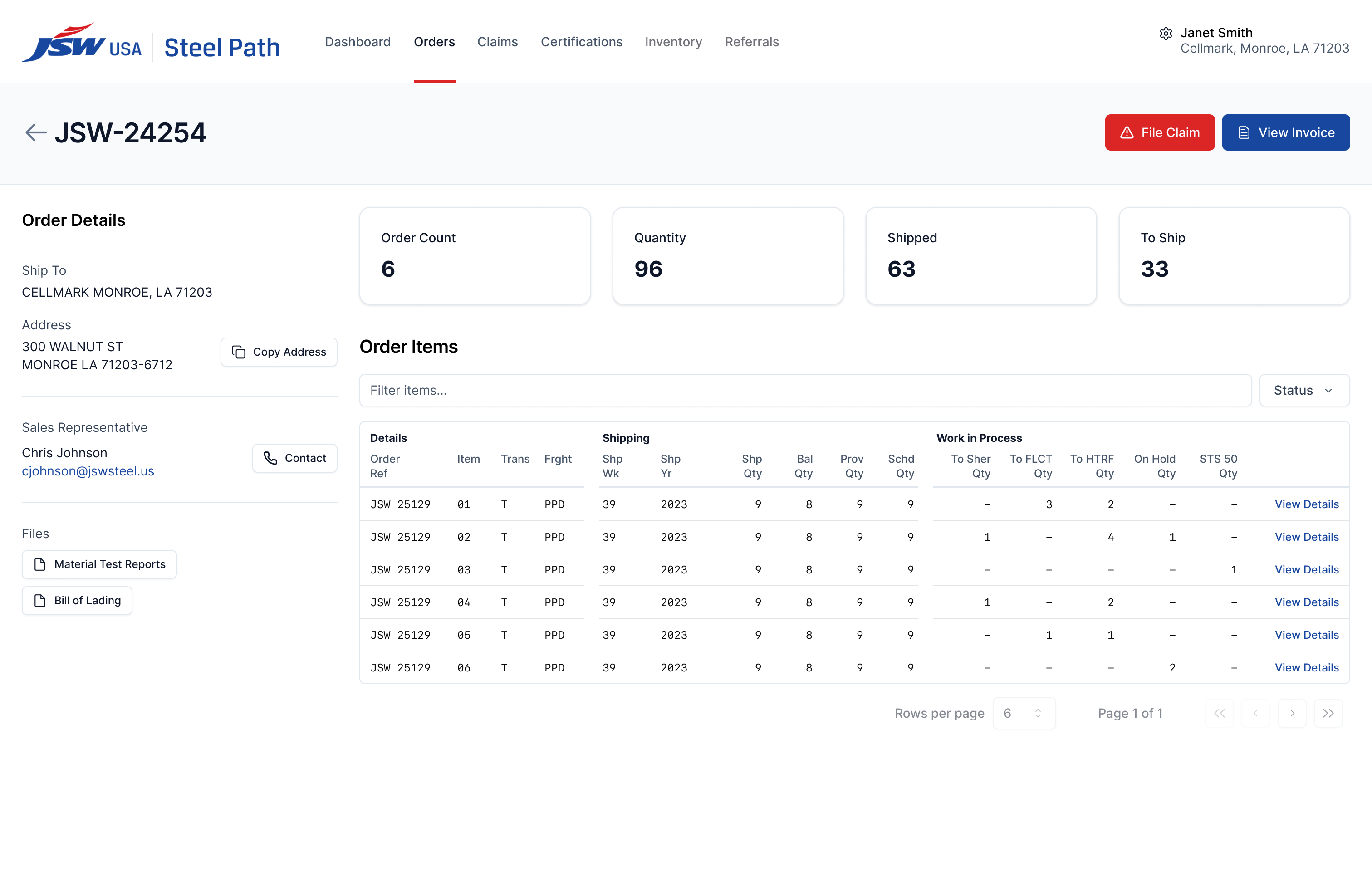
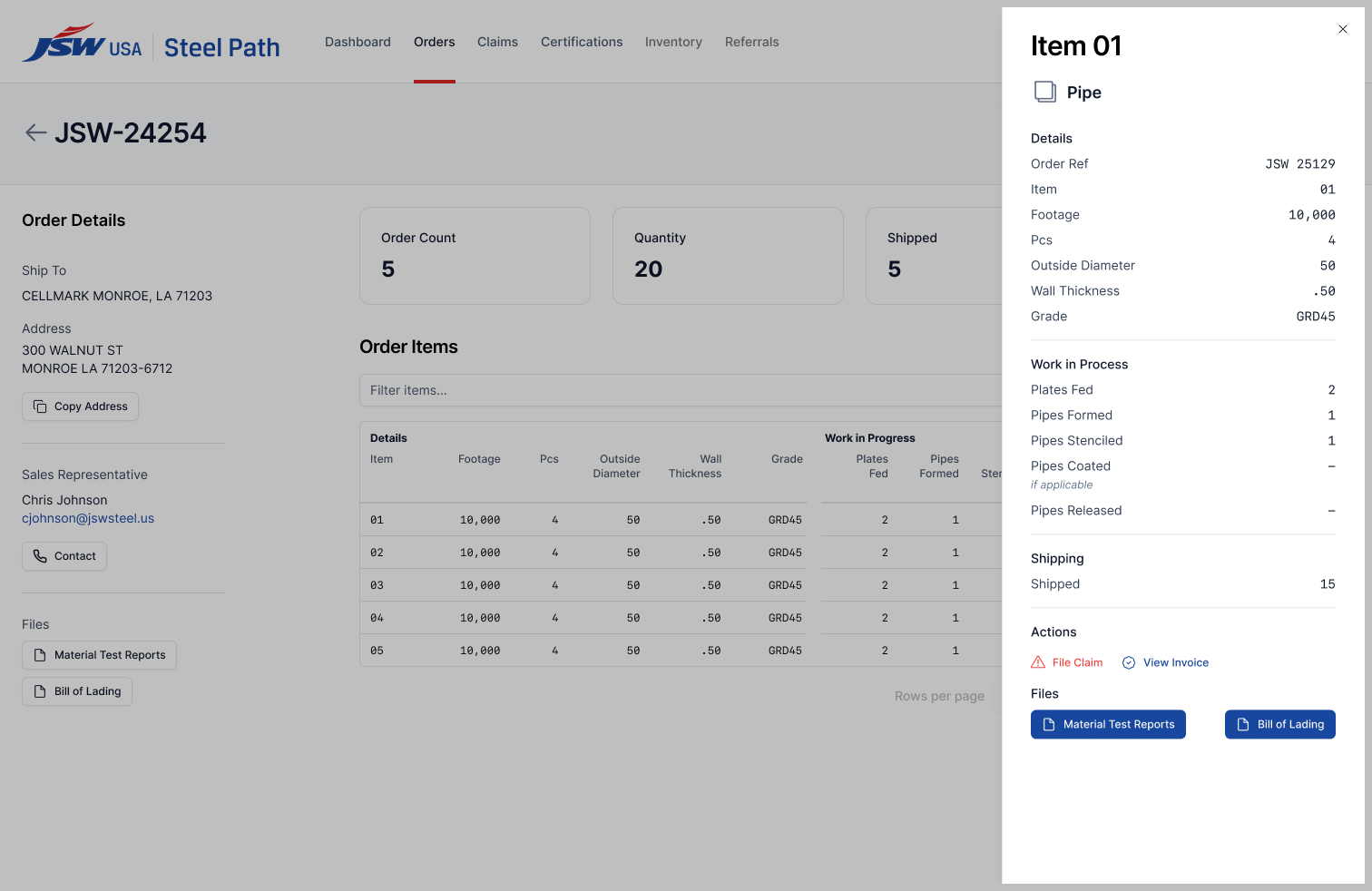
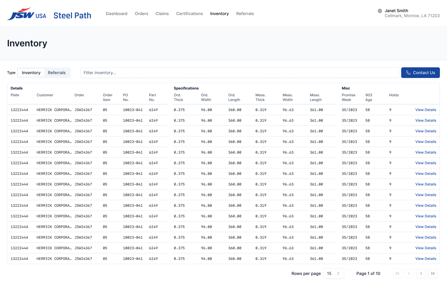
.png)
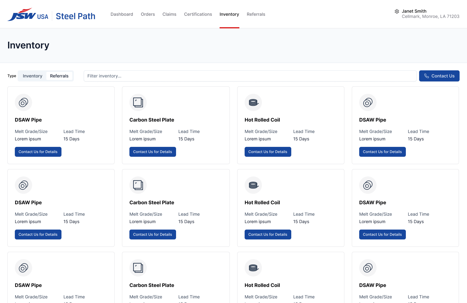
JSW Steel's sales team struggles to keep track of information for their customers on a day-to-day basis because information they need regularly (orders, inventory, claims, and more) are spread throughout multiple platforms that can even vary by location of the steel facility.
Objective
To build a platform that combines this data in a way that is easy to navigate and understand to allow the sales and management teams a better ability to keep clients and themselves stay informed of the ever-changing status of products.
See Full Screenshots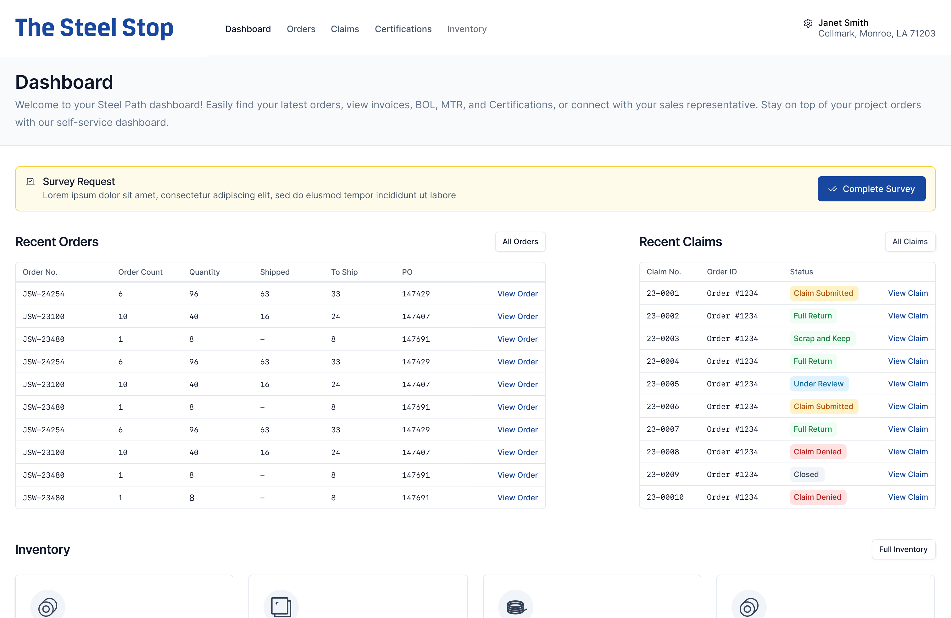
Process
Research and Challenges
Research for this product included many discovery sessions with those that will use the platform the most–internal sales and management members. Along with the client’s IT and technical team members, we were able to find pain points, areas for improvement over their current process, and discuss the best ways to create a visual information architecture to allow them to quickly gather information for various projects.
This project provided the immense challenge of figuring out how to combine datasets that did not have a consistent presentation not only from department to department, but location to location. I had to work closely with the client to connect data points in order to create a consistent display of this scattered data. This was a time-consuming and painstaking process, but it proved invaluable in completing the design.
Design and Development
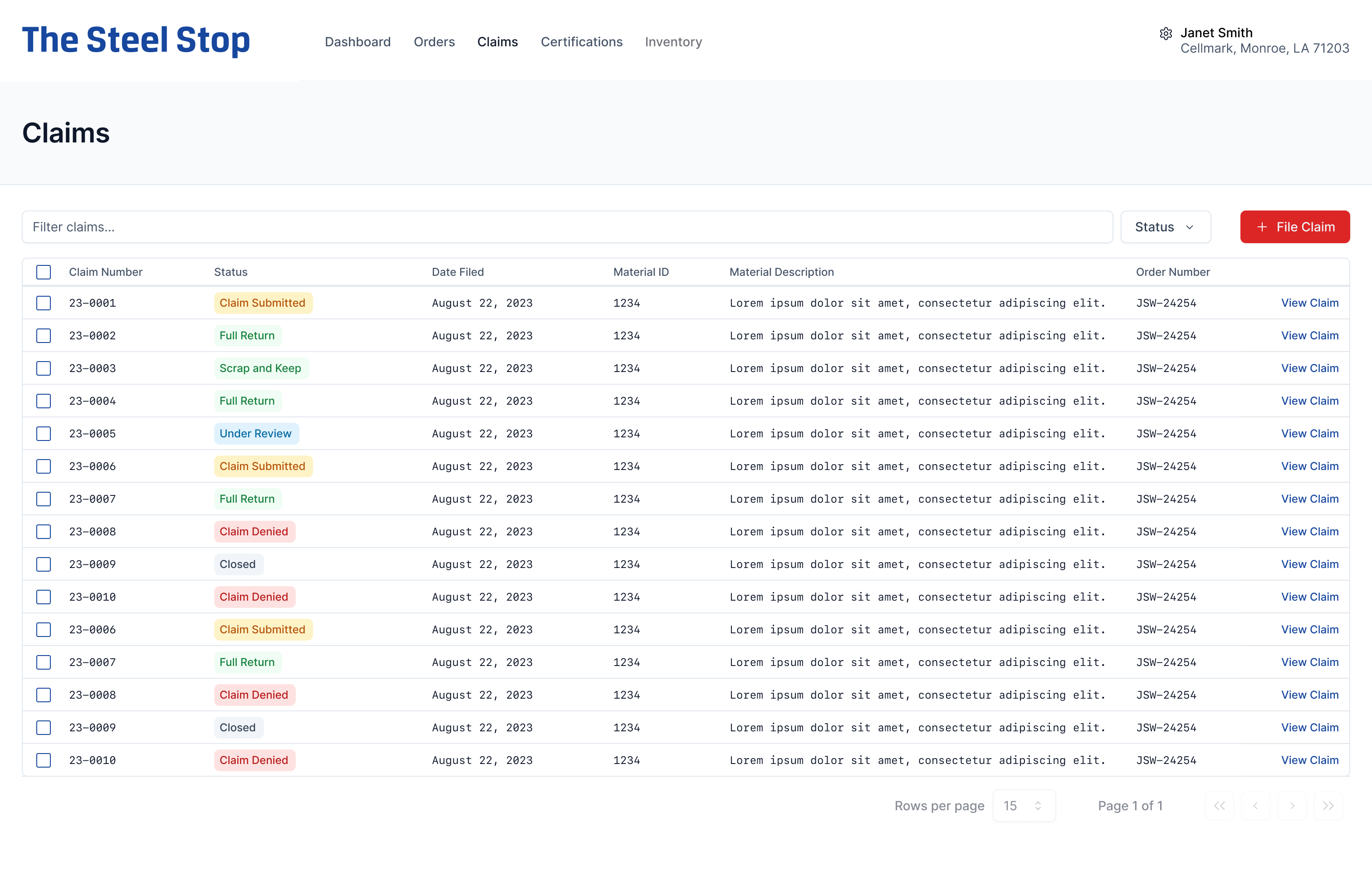
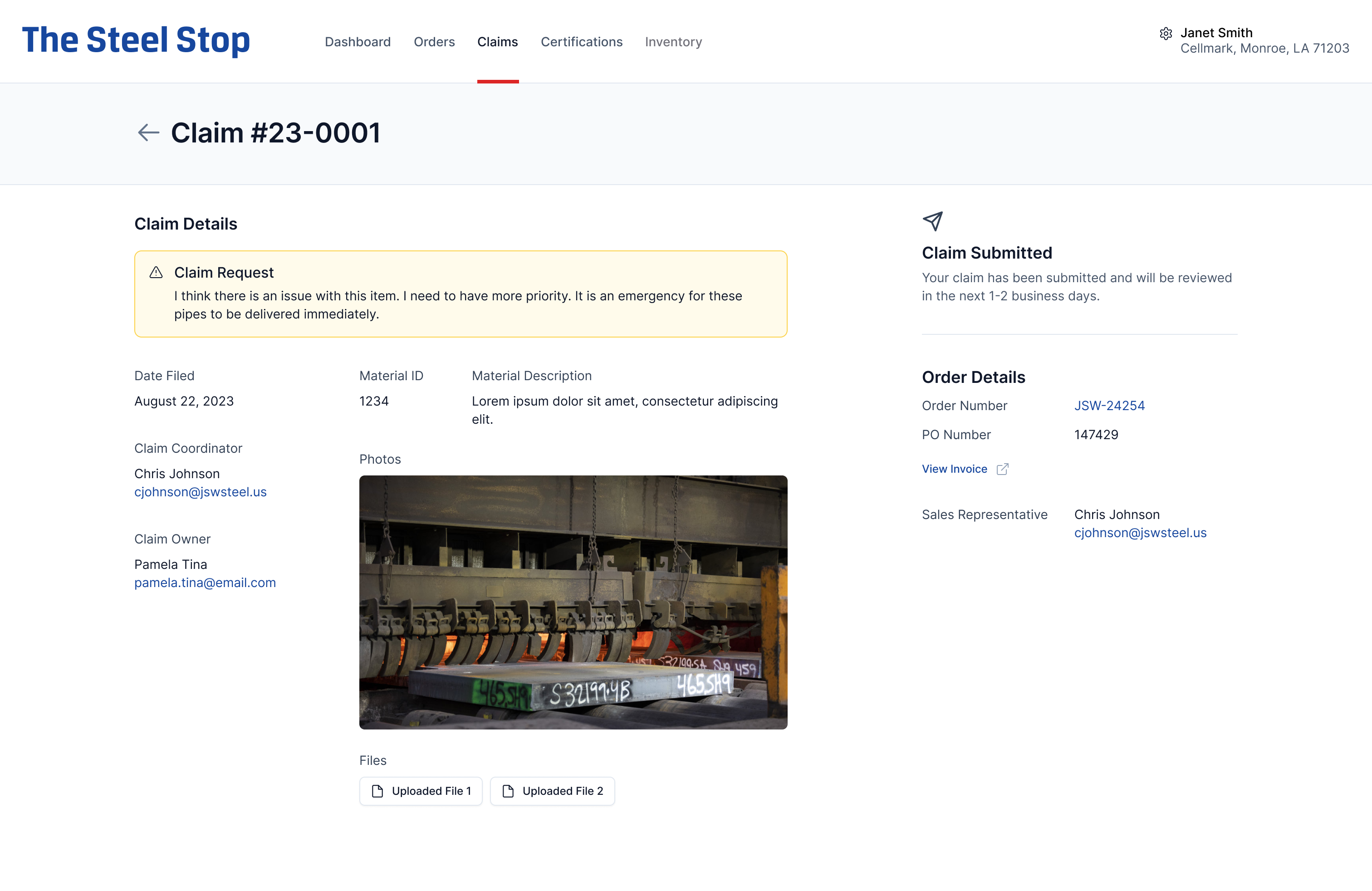
The client trusted us to create a design mostly independent of their input. They wanted to focus on the user flows and display of information rather than worry about color schemes, spacing, and other design practices. After receiving the client’s branding elements, I went to work creating a minimal style guide to build out components for the product in Figma. After receiving their current datasets and seeing how they were currently being displayed in spreadsheets, I worked closely with the client to determine what information was vital, and what information could be tucked away.
This allowed us to create a much cleaner layout on many of the information detail screens without having to sacrifice the display of any details. After presenting designs and working through reviews and iterations with the client, we were able to settle on a layout that the client believed succeeded in our initial goals.
.png)
.png)
Results and Impact
They have discussed how much time sales and management has saved in gathering data and information for their customers when efficiency is imperative. While the application is currently only being used to view and export data, discussions have begun for future versions to include data input, reporting, and more detailed tracking information.
The client has reported very positive feedback from those using the application.
